Customize ZeBrand's Brand Guidelines with the Custom Component Feature
ZeBrand adds new functionality to bring a little more flexibility when customizing brand guidelines.
-
How ZeBrand Customized Brand Guidelines
- Customize Brand Guidelines: Visual Identity - Logo Section
- Customize Brand Guidelines: Color Section of Visual Identity
- Customize Brand Guidelines: Typography Section of Visual Identity
- Customize Brand Guidelines: Photography Section of Visual Identity
- Customize Brand Guidelines: Add More Personalization
Brand guidelines are essential for keeping your brand consistent across all touchpoints.
They're a great way to ensure everyone on your team — from designers to developers to marketing folks — is working off the same page.
ZeBrand's Brand Guidelines builder is made up of various sections that outline how to implement the branding and should be used for keeping your company looking polished, professional, and well-managed.
This helps keep your design team on track with your brand's overall vision. Without a clear set of rules, designers can become confused when it comes to matching the right typeface with the right color palette and so on. With a strong set of brand guidelines in place, they can easily find what they need without wasting time searching through different documents or asking questions that could be answered by simply referring to the guidelines.
If you’re working with an agency or freelancer who isn’t familiar with your brand, they will be able to see what is expected of them in terms of branding by looking at your brand guidelines.
Entrepreneurs can easily create their own brand guidelines within ZeBrand’s brand-building platform. The Brand Guidelines is broken up into three sections: Brand Strategy, Visual Identity, and Messaging.
Recently, we’ve launched a new feature where you can add your own components to the Visual Identity section. It allows for more customization of your guidelines. If you want more ideas, check out the examples below.
How to Customize Brand Guidelines
Adding customized sections in your Brand Guidelines is pretty simple. Each component can have a title, description, and image. Follow these steps to create your own:
- Log into your brand account
- Create Brand Guidelines by defining your brand strategy, designing your visual identity, and updating the messaging
- Go to the Visual Identity section under Brand Guidelines
- Each section (Logo, Color, Typography, and Photograph) will have a Customize Component
- You can add up to 5 components for each section
How ZeBrand Customized Brand Guidelines
Below are examples of how we customized our brand guidelines.
Customize Brand Guidelines: Visual Identity - Logo Section
The Logo section of Brand Guidelines currently includes the primary logo, secondary logo, clear space, and logo misuse examples.
You can consider adding other unique components like logo placement.
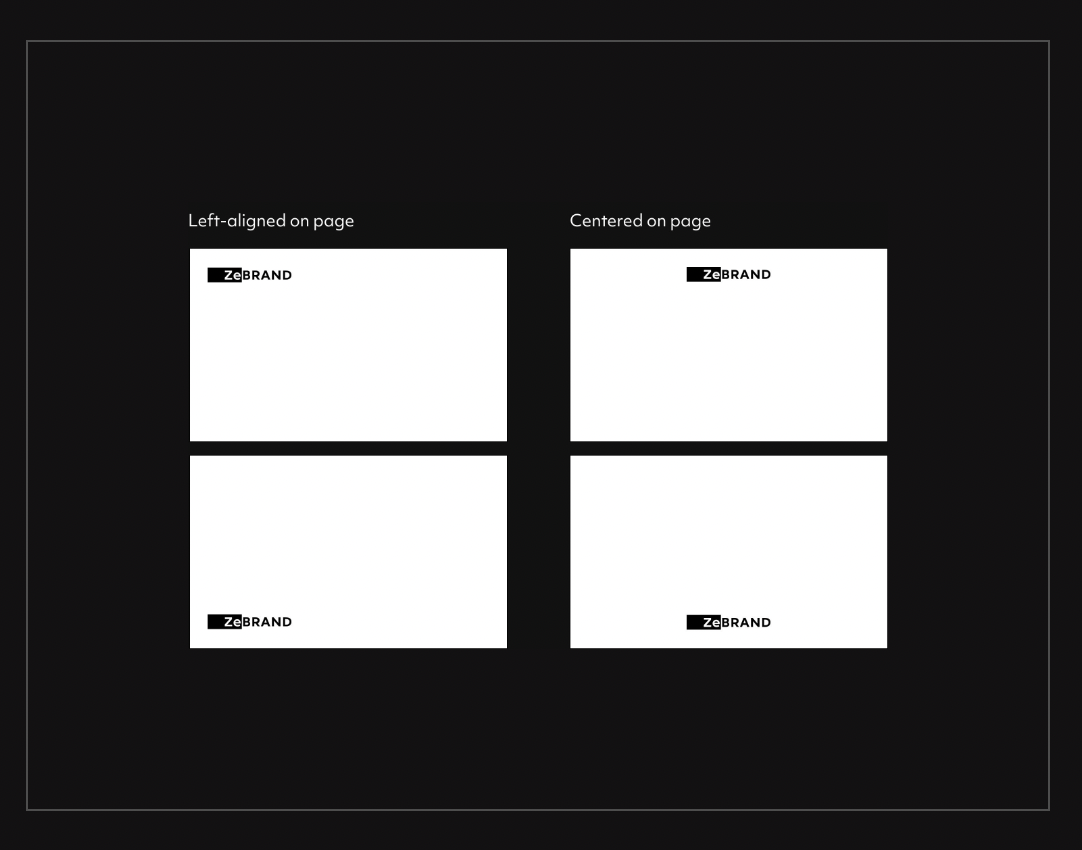
In most cases, the logo placement of the ZeBrand logo should be left-aligned or centered on the page. This logo location is natural for the “Ze” to fit snugly on the page and affords maximum visibility.
By following these rules, we always know where the logo is and where it should be. We want to ensure the logo has sufficient clear space for breathing room.
Customize Brand Guidelines: Color Section of Visual Identity
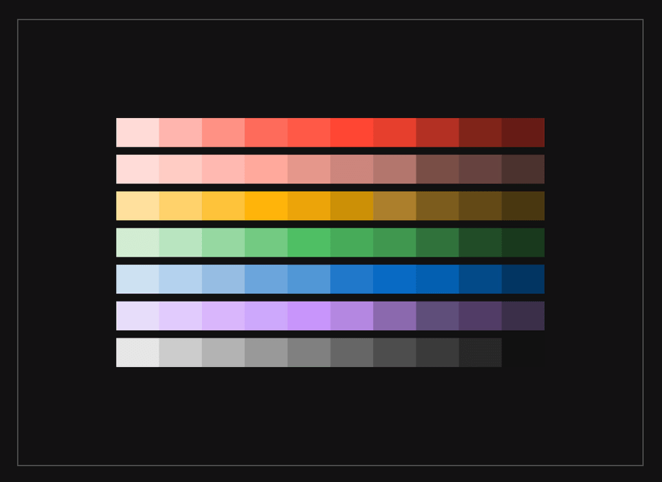
The Color section of Brand Guidelines currently includes a color palette for the primary color, secondary color, and two highlight colors.
If you want to include more colors, you can consider adding a section to feature the other highlight colors or tints.
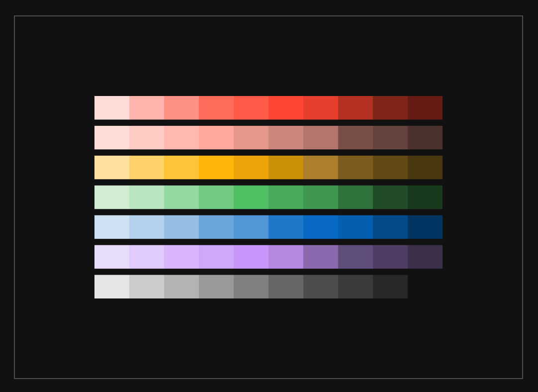
Tints are good for UI components and graphic assets that may require additional use of lighter and darker shades. Shades can be applied to texts, images, and background content to enhance contrast.
Customize Brand Guidelines: Typography Section of Visual Identity
The Typography section of Brand Guidelines currently includes primary font, secondary font, and typography misuse examples.
Consider adding guidelines on which font weights they should use.
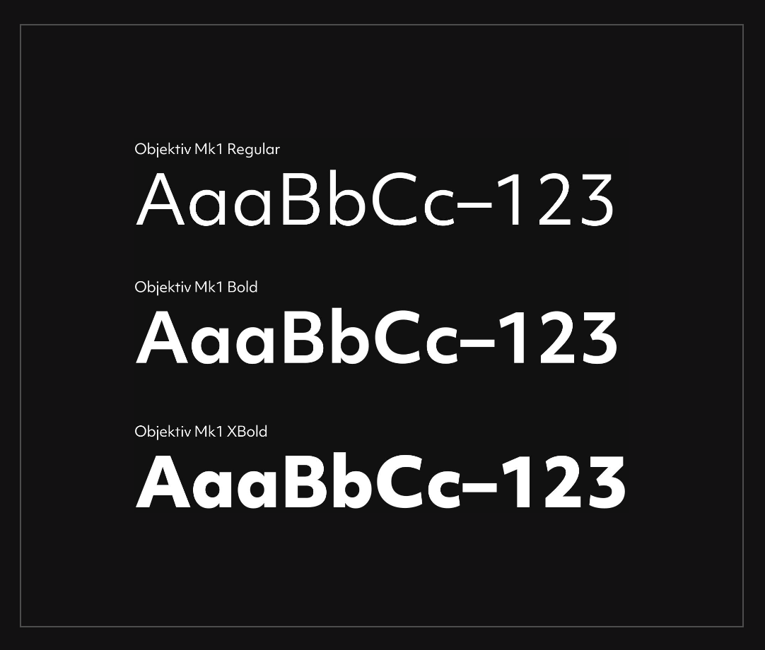
For example, ZeBrand uses Objektiv Mk1 in three weights: Regular, Bold, and XBold. These weights are also available in italics. We ask our designers and marketers to stick to these three weights to ensure consistency and avoid mixing too many textures and weights in our copy.
Customize Brand Guidelines: Photography Section of Visual Identity
The Photography section of Brand Guidelines currently includes samples of imagery that fits the brand's look and feel. Consider adding a photography misuse section.
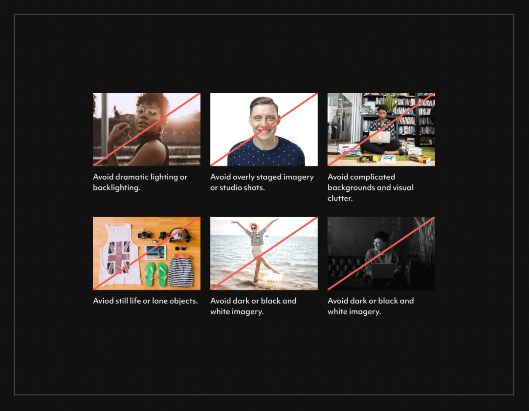
Photography Misuse – since both typography and logo have misuse examples, we also decided to create rules on things to avoid when using photography throughout our website and assets.
Customize Brand Guidelines: Add More Personalization
Our product team is working on developing a way to add custom sections, but until then, if you’d like to add more personalization, we recommend adding it within the Photography section. We added other visual elements such as creative shapes, functional shapes, icons, and illustrations.
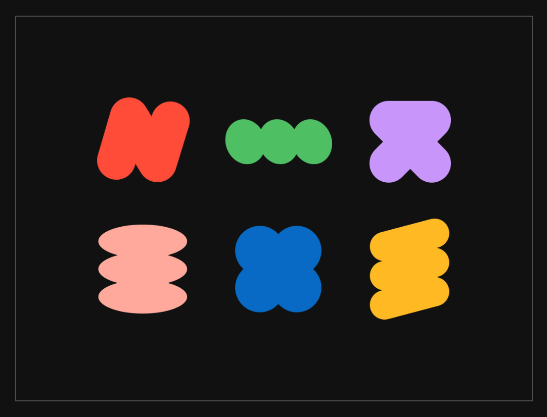
Creative shapes are compositions created to highlight the creativity of ZeBrand’s offerings. Creative shapes can be used in instruction manuals, websites, or places to help users better digest information.
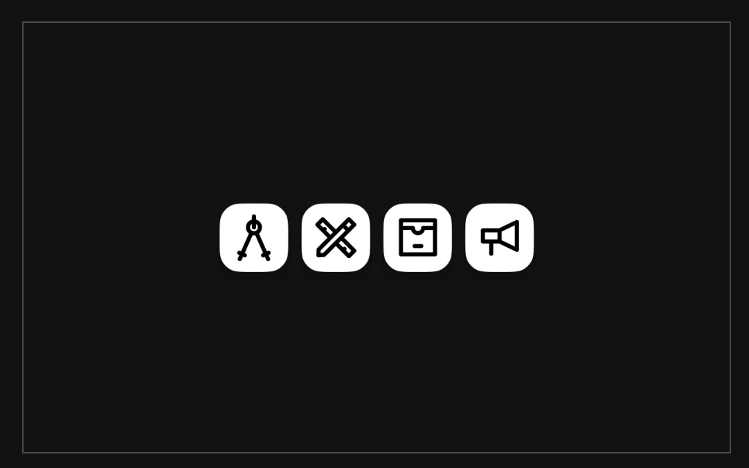
We also have some icons that appear throughout our brand. These are illustrative but not as detailed and are used on smaller scales, usually as spot illustrations.
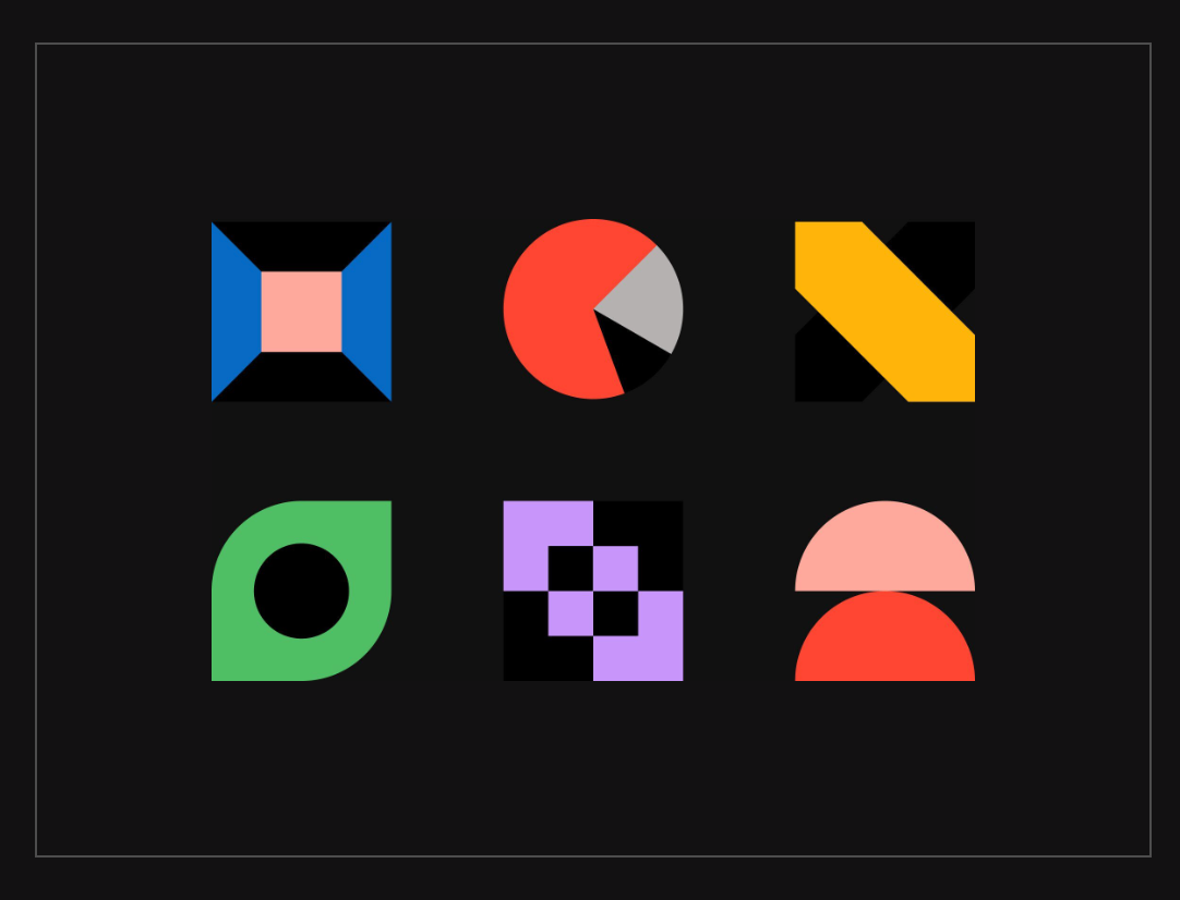
Functional shapes are compositions created to show a particular process within Zebrand’s offerings. Each element is made from a grid of equal length and width and consists of primarily geometric shapes.
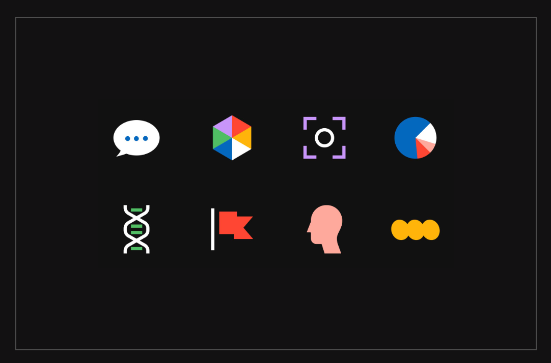
Illustrations can be used to represent the branding process and product capabilities visually. The style is clean and diagrammatic, consisting of black outlines and pops of color to indicate words or points of importance.
Additional Inspiration for Customizing Brand Guidelines
We’ve used our brand guidelines as an example, but there are many other ways to use the customize section. Refer to other brands for inspiration.
- Starbucks: Includes a timeline in the logo section, expressive colors that are used based on the seasons, a chart to lay out the range of illustrations based on expressive to functional, and examples of how it’s used on the packaging, gifts cards, and websites and the difference between product photography and editorial photography
- YouTube: Logo sizing rules and promotional do’s and don’ts
- Dropbox: Includes glyph explanation, how to use the logo within different applications, and product screenshots
- Slack: Logo usage on backgrounds, primary, secondary, and partnership lockup instructions, accessible color combinations, ideal type stack from H1 down to the paragraph, quotes, and attribution, video guidelines on lower-thirds, ending slates, and watermarks
Maximize Your Brand Guidelines Through Customization
To summarize, here is a comprehensive list of examples:
- Logo – Logo placement, timeline, sizing rules, how to use in apps, partnership lockup instructions
- Color – Other highlights, tints, or seasonal colors
- Typography – Font weights, type stack
- Photography – Photography misuse, mood boards, product screenshots, packaging examples
- Other – Creative shapes, functional shapes, icons, illustrations, and video guidelines
As mentioned, brand guidelines are so important because they help ensure that every aspect of your business reflects your brand identity. If you haven’t created brand guidelines for your business, get started for free with ZeBrand here.


