Expanding your Visual Language
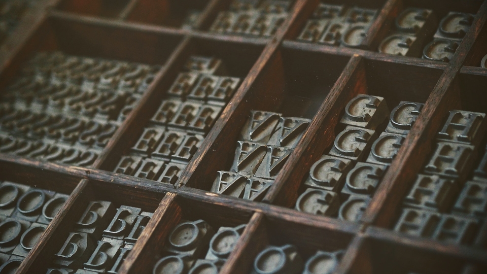
Aside from how words and sentences sound, a crucial part of how language is interpreted is how it’s read, ie. how the letterforms actually look.
At ZeBrand, we believe your vision deserves to be seen and realized. In this content series, we help you use brand as a tool to power up your business and jumpstart your growth.
Welcome to Part 7 of A to Ze of Brand Building -- 'Expanding your Visual Language'. (Read Part 6 here if you missed it!)
Expanding your Visual Identity: Typography, Imagery, and Beyond
Rebranding a brand’s look and feel rarely makes it into the news, but when it does, a lot of focus is placed on what’s immediately apparent: new names, logos, and color palettes. But in a world where people expect brands to be seamless and socially-oriented—contributing to community as much as they do to commerce—over-reliance on logos can be counterproductive.
As brands become deployed throughout multiple touch points and an assortment of screen sizes, elements beyond color and logo must do their parts in expressing the brand identity. They can be distinctive or subtle but just as effective, if not more expressive and relevant in today's branding world. In this article, we go through these underdogs of visual identity: Typography, Photography, Illustration, Icons, and Graphic Elements.
Typography
Aside from how words and sentences sound, a crucial part of how language is interpreted is how it’s read. In other words, how the letterforms actually look—as individual letters, in fully-formed words, and across pages and paragraphs.

Photo by Valentin GIRARD on Unsplash
We’ve already briefly discussed typography as an element that adds character and communicative power to a wordmark logo. The Disney wordmark, for instance, is known for its energetic cursive that conveys a world of whimsy and fantasy. In contrast, the Bank of America wordmark, set in bold capital letters, communicates trustworthiness and stability. The Cartier wordmark communicates something entirely different with its italicized letterforms with strokes that resemble a fountain pen signature that speaks to craft, luxury, and history.
But typography isn’t just a matter of personal taste. Fonts, more formally known as “typefaces”,are full sets of characters designed with unique characteristics and available in different weights, giving them plenty of personality and communicative potential. The biggest points of structural differentiation are: Serif or sans-serif (with or without the decorative flourish at the end of a letter), kerning (the spacing between individual letters in a word), leading (the spacing between lines of text in a paragraph), and weights (how thick the line widths are). All of these technical considerations together make a typeface unique and, most of all, expressive.

Photo by "My Life Through A Lens" on Unsplash
There are certain connotations and historical trends reflected in typefaces as well. If you choose a Blackletter typeface, a style that originated in the 12th century, you’ll immediately generate a medieval, Gothic feel to your design. Or set a paragraph in Caslon to evoke a sense of authority, class and sophistication that hearkens back to its 18th century origins (in fact, the U.S. Declaration of Independence was set in this typeface). Want something minimalist and timeless? Then Futura, created in 1927 when design was all about stripping back on ornamentation and focusing on function, might be a worthy choice.
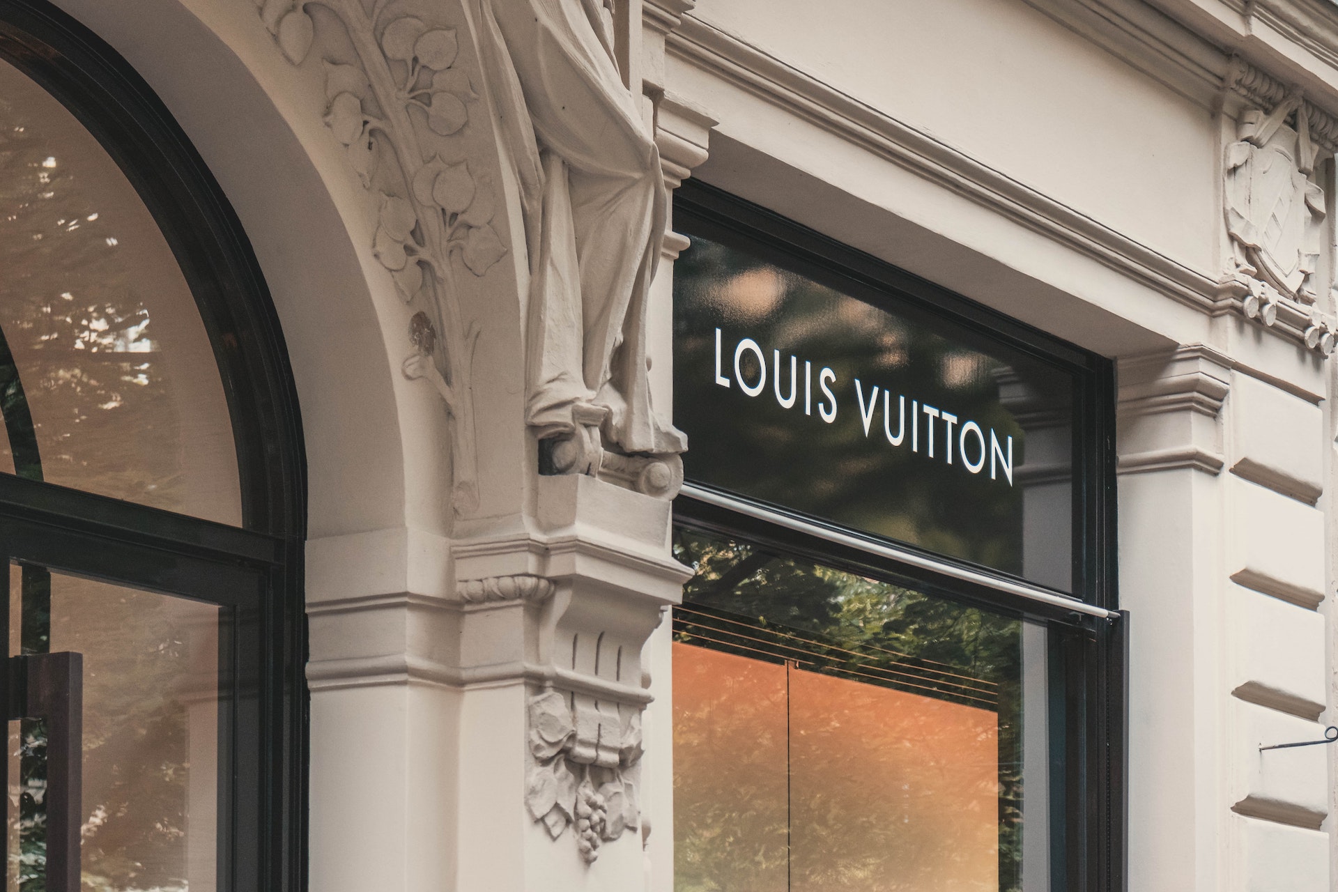
What’s important to remember about typography however, is that beyond its expressive properties, it must be legible. And the core purpose behind legibility is readability—that it must not be a distraction from the content that you’re trying to convey. This is why the Swiss font, Helvetica, known for its precision and uniformity, has found its way into wordmarks of some of our most iconic brands from 3M and Panasonic, all the way to Jeep and Toyota.

Photo by Andrea Leopardi on Unsplash
Photography
They say a picture tells a thousand words, and it’s imagery we now discuss.
The photography you choose to use can make a big impact on your designs. Content and subject matter are critical— it reflects the lifestyle or worldview that you want to convey. In the world of sports, Adidas looks markedly different from its competitor Nike, especially in its photography style that straddles street style and high fashion. Some of its ads for products like Ultraboost look more like pages from Vogue than it does a sportswear advertisement. In the tech world, Microsoft has shown us that it’s in tune with its wide-ranging audience by showing creative people in their habitats: working from home, in their studios, or artistically designing new floral arrangements. Apple, on the other hand, champions dramatic photography of their products, showcasing the innovation and sleekness of design that has become a status symbol of its own.
Photography styles are defined by many techniques, including composition, framing, layout, color tones, angles, and effects. These cumulatively create the impact that your photography has in communicating a certain look and feel. Let's contrast the photography style of two iconic luxury watch brands: Omega harnesses portrait photography, featuring solitary celebrities who are constructed and posed, staring at the camera in dimly lit lighting as if emerging from the shadows. But Patek Philippe's definition of luxury manifests in a starkly different style. One ad depicts a seemingly candid and joyous moment between parent and child, set in a high-contrast grayscale tone, painting a picture of luxury as timeless and something that is handed from generation to generation.
Illustration
Although photography is impactful, what happens when you can’t find the right imagery for your product or brand? In these cases, illustration can be a powerful substitute.
It’s no coincidence that brands like Slack, Uber, and Dropbox — digital brands that exist primarily in the cloud—use an abundance of illustrations in their communications. Not only does it help convey intangible products and ideas, it also breathes life and personality into otherwise straightforward services. In some cases, illustrations play a prominent role and become the heart of the brand, as we’ve seen in Casper, the mattress brand known for its whimsical drawings that play on ideas around sleep, comfort, and dreaming. And because illustrations are free from the constraints of reality, the creative possibilities are endless!
Icons
Icons also play a critical role when it comes to day-to-day wayfinding. They are simplified illustrations, often used at smaller scales and for functional purposes. They are the pictorial cues used to communicate a shopping cart for checkout, to scroll in a specific direction, or to get back to the home screen. Although icons often follow a universal standard, stylistic distinctions and design can make them unique to your brand and add to your holistic look. At companies like Google and Apple, people spend hours and hours perfecting these icons for maximum intuitiveness in their product UI. And they’re just as important in physical spaces—the New York Subway and London Underground still remain world-renowned for their easy-to-follow wayfinding systems.
Functional icons can, however, be unique to your product and creatively used in an engaging and memorable way. An icon resembling a lightning bolt might be a more compelling way to represent something that is lightning fast. A sprouting seed icon can represent something that is in its early stages. Get clever while making sure that the message is understandable and on-brand.

Supportive Graphic Elements
Supportive graphic elements can also help express your brand in various scales. These could be a set of shapes, lines, patterns, or textures that are in line with and support your visual identity. A common place for inspiration is in a brand’s logo — the shapes or lines found within one could be used as subtle background graphics for slides or banners, or repeated to create a pattern. Qantas does this by taking cues from the lines from its iconic kangaroo logo. Another classic one is the Coca-Cola graphic that’s derived from its script logotype. Just by seeing a red background with a running white “wave” or ribbon-like device, one recognizes the brand without any words or name attached to it.
Graphic elements can come to life through motion design, which is also an art onto itself. How do shapes and logos move and respond when you interact with them? Content platforms like Netflix are masters of the sting—that witty little moving band intro you see at the beginning of every episode. These subtle cues are not only useful but they also elevate the experience in a branded way.
There’s so much more to a brand’s design than immediately meets the eye. When you look beyond logos and colors, you can unlock a visual toolkit that’s just as important in communicating your purpose. And it’s only getting broader. So go out and explore!
A to Ze of Brand Building is a 10-part series about all things branding, with an eye to using branding to engage your customers and grow your business. Continue on to Part 8: Finding your Brand Voice.
