How Brands Use Colors In Their Branding

Choosing the right color for your brand is an important aspect of branding.
The Importance of Colors for Branding
Color has a large role in defining your brand identity. Research curated by Colorcom has shown that people make a subconscious decision about a product within 90 seconds of seeing it. Between 62% and 90% of this assessment is based on color.
You might be a new furniture brand trying to capture the interest of students or a bank trying to expand your user base. Whatever your business proposition is, using appropriate colors in your branding may help you capture the interest of your target audience. In this article we look at what color psychology is, why colors are important for branding, with examples of brands that have successfully chosen a suitable color for their branding.
What is Color Psychology?
Color psychology is the study of how colors impact behavior. The subject is studied extensively. In branding, color affects how customers perceive a brand and relate to it. Brands use colors to convey a specific message to customers.
We should note that people may have a subjective perception of color, based on their own experiences and cultures. But there are still a few points related to color in branding that is generalizable and worth understanding before choosing a color for your branding.
7 Branding Colors and How Brands Have Used Them Successfully
Some brands take their colors very seriously. Brands like Cadburys and Tiffany have even trademarked their shade of branding color. Let us look at how famous brands have used colors in their branding and marketing.
1. Red
Red is associated with excitement and energy. It suggests passion and is proven to increase your heart rate. The best example of a brand using and owning red is Coca Cola. Coca Cola’s association with red is said to have started when the company started to paint barrels containing Coca Cola red so those barrels could be differentiated from those containing alcohol during transportation.
Red is also a popular color of choice for fast food brands like Pizza Hut, McDonald’s, and KFC.
2. Orange
Associated with playfulness, orange has a broad appeal for many brands. Nickelodeon is unthinkable without its bright orange logo. Home Depot is another business that uses orange for everything, from the color of its stores to branding.

Photo by Jon Tyson on Unsplash
3. Yellow
Yellow suggests optimism and promise. Brands that use yellow include Nikon, which attaches a lot of meaning to their choice of colors (yellow and black). Yellow in their logo is set to denote expansion, and black is to convey trust and quality.

Photo by Annie Spratt on Unsplash
4. Green
Green is a color of optimism, often featured in people’s ‘favorite colors’. It represents nature, stability, and prosperity. A wide range of brands use green in their branding.
Android uses it as one of its primary colors. Another brand almost synonymous with green is Starbucks. The company started with a brown logo but then went on to change it to green in 1987 to symbolize California, where the founders are from. Starbucks uses the color green not just for its relaxing vibe but also as a core of its business strategy, aiming to be more energy-efficient in its stores.

Photo by KAL VISUALS on Unsplash
5. Blue
Blue is one of the most popular choices of color for brands. It is associated with trust and helps instill confidence. It helps people become calm.
It is popular with financial companies. Paypal and Visa are great examples. Social media companies like Twitter and Facebook also employ the use of blue in their branding. Although with Facebook, the origins of this choice are said to be in Mark Zuckerburg’s color blindness, which means he can see the color blue the best.

Photo by Sara Kurfeß on Unsplash
6. White
White denotes simplicity, cleanliness, and virtue. It has broad applications and is often used by brands as part of their branding.
It is a popular choice with technology products, the best example of which is Apple. Apple uses silver, white and black in their branding but their iconic products and branding use white extensively.

Photo by zhang kaiyv on Unsplash
7. Black
Black suggests sophistication, discipline, and luxury. It is used by a lot of brands in some form but let’s look at those brands that use it as their primary color.
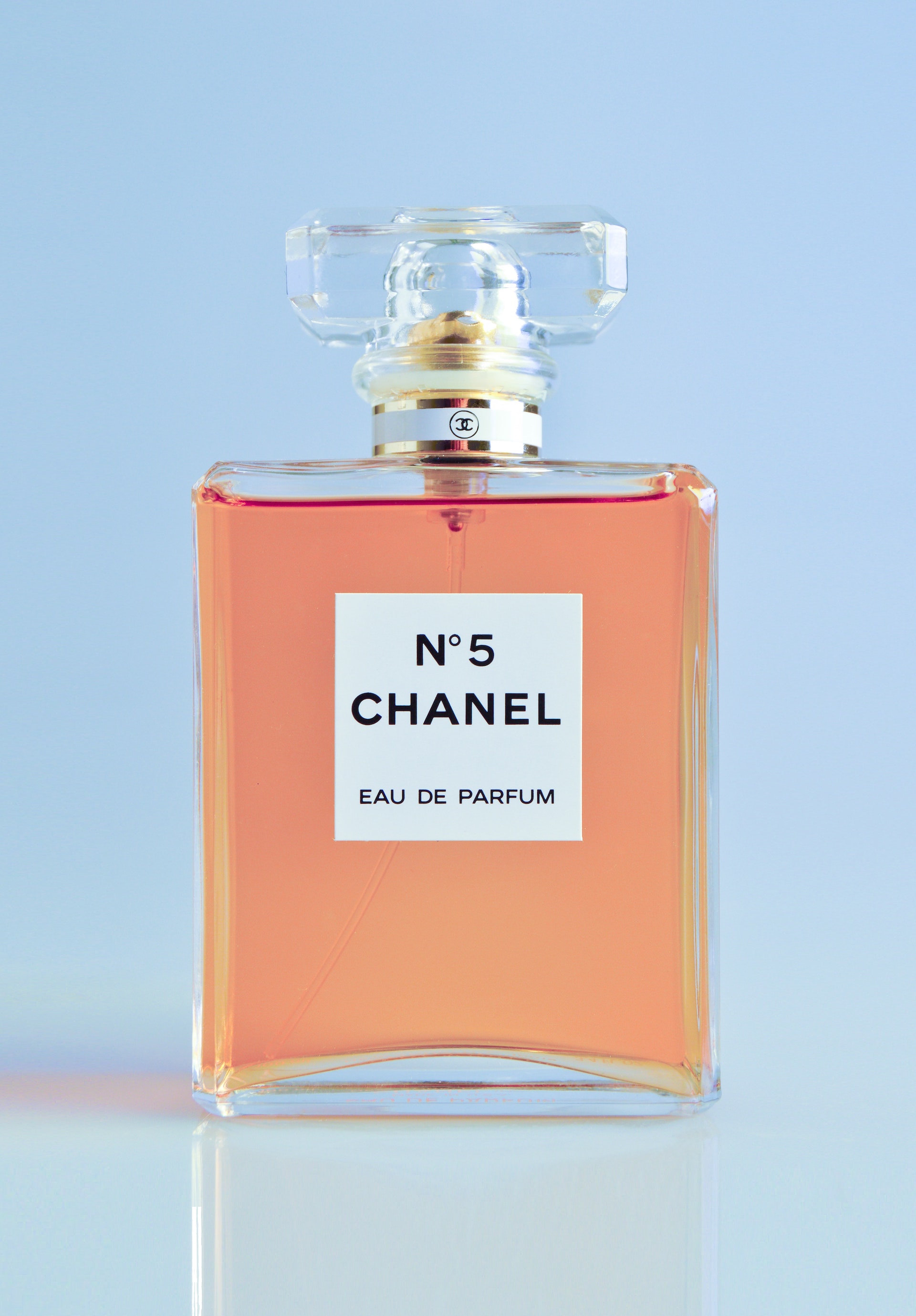
Chanel uses black as a neutral color, as a way to showcase their products, suggesting luxury and heritage. Black is also used by sporting companies like Adidas, Nike and Puma as it helps convey their values of discipline, endurance, and confidence.

Photo by Miguel Andrade on Unsplash
As you start to establish your business, it’s a useful exercise to research color psychology and understand what colors you can use to send the right message to your audience. The color you choose for your brand should then be incorporated across all your channels -- right from your logo, to your website and packaging. Color can be a powerful method to differentiate yourself from other businesses and also a great way to establish your own brand identity.


